Have you ever picked up a brochure about a therapeutic procedure, product or medication and felt like you were going blind from information overload?
If you’re in the medical profession you probably haven’t because you understand what you’re reading. It’s much more likely you’re the perpetrator, not the victim, of numbing numbers, boring bullets, drab details …
BORING BROCHURES.
We’re not judging. You’re busy making people’s lives better, actually doing what those brochures attempt to describe. All you need is a little help explaining to us regular folk what you have to offer.
Here are a few Don’ts and Do’s for your next brochure design:
#1. DON’T tell us everything. DO tell us about what’s most important to us.
Most clients don’t care that the research was done by such and such lab and that it was a double-blind study and that there were 1,000 participants and so on, and so on … just tell us it works! Bullet points are great.
- Here’s how it can help you.
- Here’s how it works.
- Here’s who it’s for.
So they can say, “Got it, thanks!”
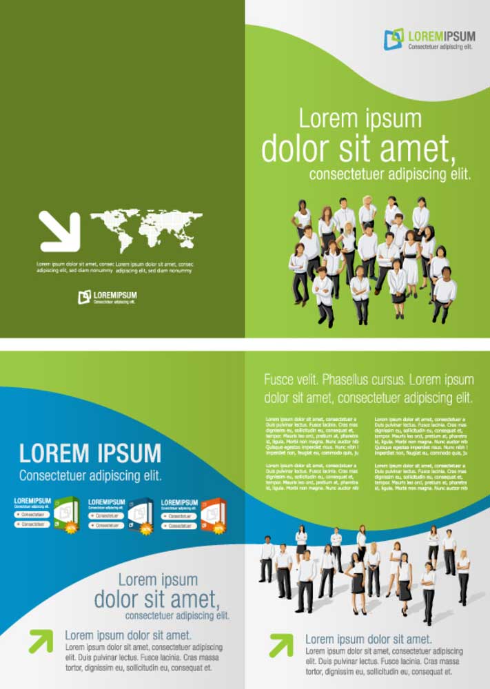
#2. DON’T do 100% text. DO show us the benefits with pictures.
People tend not to trust written product claims. They’re much more likely to believe it works if they can see it. Be as genuine as possible with images. Real before and after photos, actual clients (assuming you have their consent), etc.
#3. DON’T get crazy with the fonts. DO choose two or three, tops.
It’s a common mistake to think it’s more visually interesting to have lots of different fonts. It’s really just distracting and annoying. Usually all you need is a large header font for section titles and a smaller font for the body of the text.
#4. DON’T fill up your available space. DO embrace white area as part of the design, not wasted space.
Whether it’s our desktops, bedrooms or the brochures we pick up, we humans tend to feel overwhelmed when we encounter clutter. On the other hand, feeling like what’s in front of us is manageable is comforting. White space is your friend.
#5. DON’T leave us hanging. DO tell us exactly what you want us to do.
Call this number and say this. Go to our website and watch this. Visit our office during these hours, ask for Barb, give her this brochure, say these words … okay, you get the idea. When you tell people exactly what you want them to do you remove the need for them to think too much and that’s actually a relief.
In the end, it’s all about getting the right people – the ones who are interested, who you can help – to do what you’d like them to do. Think AIDA: make them Aware, drive their Interest, spark their Desire and tell them how to take Action.
And don’t let bad design get in the way!