State of the Heart Care
State of the Heart Hospice came to Farmhouse for help giving their brand a face lift. They were entering into their 35th year in business and wanted a brand that reflected who they are as an agency and where they are going in the future. Through consultation with Farmhouse, State of the Heart decided to completely re-brand. Says owner, Angie Rogers-Howell “Since client was interested in going in a totally new direction, I really wanted to change it up. We ditched the color scheme and got rid of the heart logo that they’ve used for 35 years. The new hot air balloon element and updated color scheme really differentiate State of the Heart from others in their industry and perfectly captures the vision for the company.” 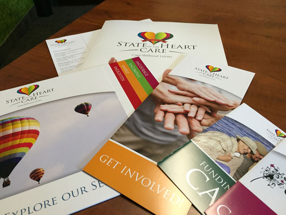
After solidifying the new brand, we worked with STOTH’s Marketing Manager to create new stationery materials such as Letterhead, Business Cards, Envelopes, etc. We also created comprehensive collateral materials including Pocket Folders, Overview Brochure and several specific flyers marketing individual areas of their program. In addition, we were also able to take the new brand we created and implement that into a brand new website for the company. Now, State of the Heart Care has a fully integrated brand that customers, employees, and the community will recognize for years to come.
When asked what drew them to the project, Farmhouse Vice President, Matt Howell, states “These types of projects are what Farmhouse lives for. We love the opportunity to work with a client, catch their vision, and help bring it to fruition. Being able to envision a new brand concept and implement it from the graphic design process, to creating collateral materials, and wrapping a website around it is truly what we love to do. Brand management from start to finish!”
Yorktown Four For the Fourth
Farmhouse has bee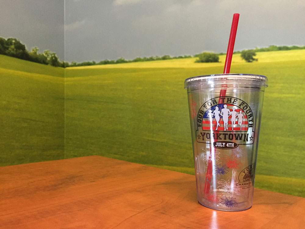 n a proud supporter of the Yorktown Four for the Fourth race for several years. In the past, we’ve produced plastic stadium cups and backpacks. This year, they wanted to do something a little different. Farmhouse came up with several ideas and samples to look at and the client decided to go with a high quality double-walled tumbler with a straw. As a collaboration with the Town of Yorktown, Yorktown Chamber of Commerce, and Yorktown Four for the Fourth, we incorporated all three logos into the layout of the tumbler. We also added fireworks elements throughout the design to add a “pop”. The end product resulted in a high quality promotional item that the client was happy to hand out and recipients were happy to use. Personally, we use ours at the Farmhouse every day and we’ve seen them being used throughout the community. You know you’ve got a hit when you see that!
Guardian Home Care
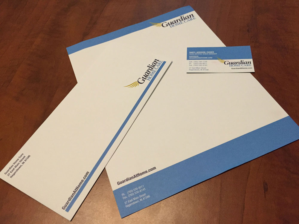 Formerly A & P Quality Home Care, came to the Farmhouse looking for help with a big change. Owner, Darryl Addison, had decided to change the name of the company to Guardian Home Care to better reflect the heart of the company. With that name solidified, Farmhouse set to the task of creating a brand to go along with it. We provided several concepts and we ultimately settled on the one pictured here. The wing concept evokes the feeling that the brand is there to be your “guardian angel” in providing service to your loved one and also carry you on your journey through the process. After finalizing the brand concept and logo, we were then able to update the existing website that Farmhouse created for A & P and update it to reflect their new name and brand. We also designed and printed their stationery items (letterhead, business cards, envelopes,etc.). When asked for comment, owner Angie Rogers-Howell, said “The Guardian Home Care has been a great project to work on. Once again, Farmhouse was able to do what we love – Help companies look their best in all areas of their marketing. Darryl trusted us with his brand and I think it really paid off!”
Pink House Properties
Owner, Brandi Shirvinski came to the Farmhouse by way of a referral from another marketing firm as well as a meet up at a local networking luncheon. Brandi had a concept for her brand and knew exactly the look she wanted. But she needed some help putting it all t![]() ogether. That’s where Farmhouse stepped in. We were able to take her ideas and put them into a brand that fit her perfectly. And, since she had some deadlines looming, we designed her logo and business cards it in less than a week! Obviously, we prefer to have a bit more time while working on projects, but we’re always willing to hustle for our clients when it’s necessary. Thanks Brandi for putting your faith in the Farmhouse. This project was a fun one to work on!
ogether. That’s where Farmhouse stepped in. We were able to take her ideas and put them into a brand that fit her perfectly. And, since she had some deadlines looming, we designed her logo and business cards it in less than a week! Obviously, we prefer to have a bit more time while working on projects, but we’re always willing to hustle for our clients when it’s necessary. Thanks Brandi for putting your faith in the Farmhouse. This project was a fun one to work on!
Websites, Websites, Websites!
Farmhouse Creative also launched new websites this summer for T&H Sweeper, Verde Mexican Restaurant, Woof Boom Radio Group, Phoenix Truss, Associates in Behavioral Counseling, Delaware County CASA, Meg’s Country Celebrations, The Muncie Civic Theatre Captial Campaign – Uphold Civic, and Just Desserts – An event happening in September to benefit the Champions for a Safe Community Fund!